
2025 Klatch 春酒
Categories
Event Visual & Motion Design
Client
Klatch Hair Salon
Project
2025 Klatch Spring Party
Services
Event Visual Design Graphic Design Motion Design
Year
2025
The 2025 Klatch Spring Party draws inspiration from Japanese Bōsōzoku culture, translating its bold street aesthetic into a distinctive event identity. Built around the themes of speed, energy, and rebellion, the visual system reinterprets the brand’s team spirit while creating an unforgettable atmosphere for its annual celebration.
2025 Klatch 春酒以「暴走族(Bōsōzoku)」文化為靈感,將日本街頭美學與品牌精神結合,打造具有強烈視覺張力的年度活動識別。整體設計以速度、力量與叛逆精神為核心,重新詮釋品牌團隊的凝聚力與年度慶典氛圍。
The 2025 Klatch Spring Party draws inspiration from Japanese Bōsōzoku culture, translating its bold street aesthetic into a distinctive event identity. Built around the themes of speed, energy, and rebellion, the visual system reinterprets the brand’s team spirit while creating an unforgettable atmosphere for its annual celebration.
2025 Klatch 春酒以「暴走族(Bōsōzoku)」文化為靈感,將日本街頭美學與品牌精神結合,打造具有強烈視覺張力的年度活動識別。整體設計以速度、力量與叛逆精神為核心,重新詮釋品牌團隊的凝聚力與年度慶典氛圍。
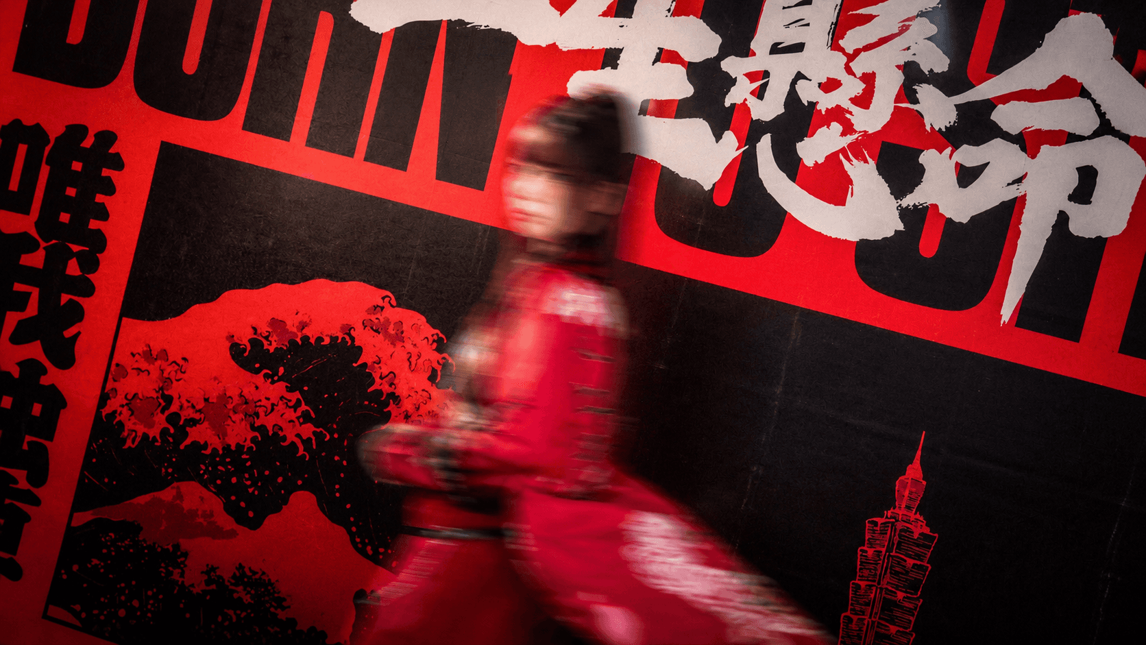
The visual language combines a bold red-and-black palette, oversized typography, and expressive textures with a reinterpretation of traditional Ukiyo-e composition alongside the iconic Taipei 101 skyline. This fusion reflects Klatch’s Japanese-inspired identity while grounding it within its Taiwanese context. The system extends across stage graphics, event tickets, and environmental applications to create a cohesive and recognizable event identity.
視覺語言以高對比紅黑配色、大膽字體與粗獷紋理構成,將日本浮世繪的構圖語彙與台北 101 地標融合,象徵品牌立足台灣,同時承襲日式文化的精神。整體識別延伸至活動背板、票券與現場應用,建立兼具文化意象與品牌辨識度的視覺系統。
The visual language combines a bold red-and-black palette, oversized typography, and expressive textures with a reinterpretation of traditional Ukiyo-e composition alongside the iconic Taipei 101 skyline. This fusion reflects Klatch’s Japanese-inspired identity while grounding it within its Taiwanese context. The system extends across stage graphics, event tickets, and environmental applications to create a cohesive and recognizable event identity.
視覺語言以高對比紅黑配色、大膽字體與粗獷紋理構成,將日本浮世繪的構圖語彙與台北 101 地標融合,象徵品牌立足台灣,同時承襲日式文化的精神。整體識別延伸至活動背板、票券與現場應用,建立兼具文化意象與品牌辨識度的視覺系統。

Developed as a complete event identity, the project translates the Klatch brand beyond graphic design into a cohesive on-site experience. Rather than serving only as promotional visuals, the design becomes part of the event atmosphere itself—strengthening emotional engagement and transforming the annual spring party into a memorable expression of the brand’s culture.
透過完整的活動識別規劃,本專案將品牌理念從平面設計延伸至實體空間,串聯每一個與參與者互動的接觸點。設計不只是活動宣傳,更成為現場氛圍的一部分,讓品牌文化透過視覺與體驗被感受、被記憶,打造具有年度代表性的春酒活動。
Developed as a complete event identity, the project translates the Klatch brand beyond graphic design into a cohesive on-site experience. Rather than serving only as promotional visuals, the design becomes part of the event atmosphere itself—strengthening emotional engagement and transforming the annual spring party into a memorable expression of the brand’s culture.
透過完整的活動識別規劃,本專案將品牌理念從平面設計延伸至實體空間,串聯每一個與參與者互動的接觸點。設計不只是活動宣傳,更成為現場氛圍的一部分,讓品牌文化透過視覺與體驗被感受、被記憶,打造具有年度代表性的春酒活動。


